시계열 데이터 시각화
다변량 시계열 데이터(Multivariate Time Series, MTS)의 여러 컬럼을 시간축에 정렬하여 시각화하는 방법
환경 설정
1
2
3
4
import pandas as pd
import numpy as np
import matplotlib.pyplot as plt
import matplotlib.dates as mdates
데이터 읽기
1
df_train = pd.read_csv('/kaggle/input/daily-climate-time-series-data/DailyDelhiClimateTrain.csv', index_col=0, parse_dates=True)
데이터 확인
1
df_train.head()
| date | meantemp | humidity | wind_speed | meanpressure |
|---|---|---|---|---|
| 2013-01-01 | 10.000 | 84.500 | 0.000 | 1015.667 |
| 2013-01-02 | 7.400 | 92.000 | 2.980 | 1017.800 |
| 2013-01-03 | 7.167 | 87.000 | 4.633 | 1018.667 |
| 2013-01-04 | 8.667 | 71.333 | 1.233 | 1017.167 |
| 2013-01-05 | 6.000 | 86.833 | 3.700 | 1016.500 |
시각화 함수
df_list: pandas DataFrame으로 이루어진 리스트
cols: 시각화할 컬럼명, string로 이루어진 리스트
x_label: x 축(시간축), string
1
2
3
4
5
6
7
8
9
10
11
12
13
14
15
16
17
18
19
20
21
22
23
24
25
26
27
28
29
30
31
def plot(df_list, cols, x_label):
    width_ratios = [len(df) for df in df_list]
    fig, axs = plt.subplots(
        nrows=len(cols),
        ncols=len(df_list),
        figsize=(10, 3*len(cols)),
        sharex='col',
        sharey='row',
        gridspec_kw={'width_ratios': width_ratios}
    )

    if len(cols) == 1:
        axs = [axs]
    if len(df_list) == 1:
        axs = [[ax] for ax in axs]

    for ax, col in zip(axs, cols):
        for ax_, df in zip(ax, df_list):
            ax_.plot(df.index, df[col])
            ax_.tick_params(axis='x', rotation=45)
            ax_.xaxis.set_major_locator(mdates.MonthLocator())
            ax_.xaxis.set_major_formatter(mdates.DateFormatter('%Y-%m'))

    fig.text(0.5, 0, x_label, ha='center', va='center')

    for i, col in enumerate(cols):
        plt.setp(axs[i][0], ylabel=col)

    plt.tight_layout()
    plt.show()
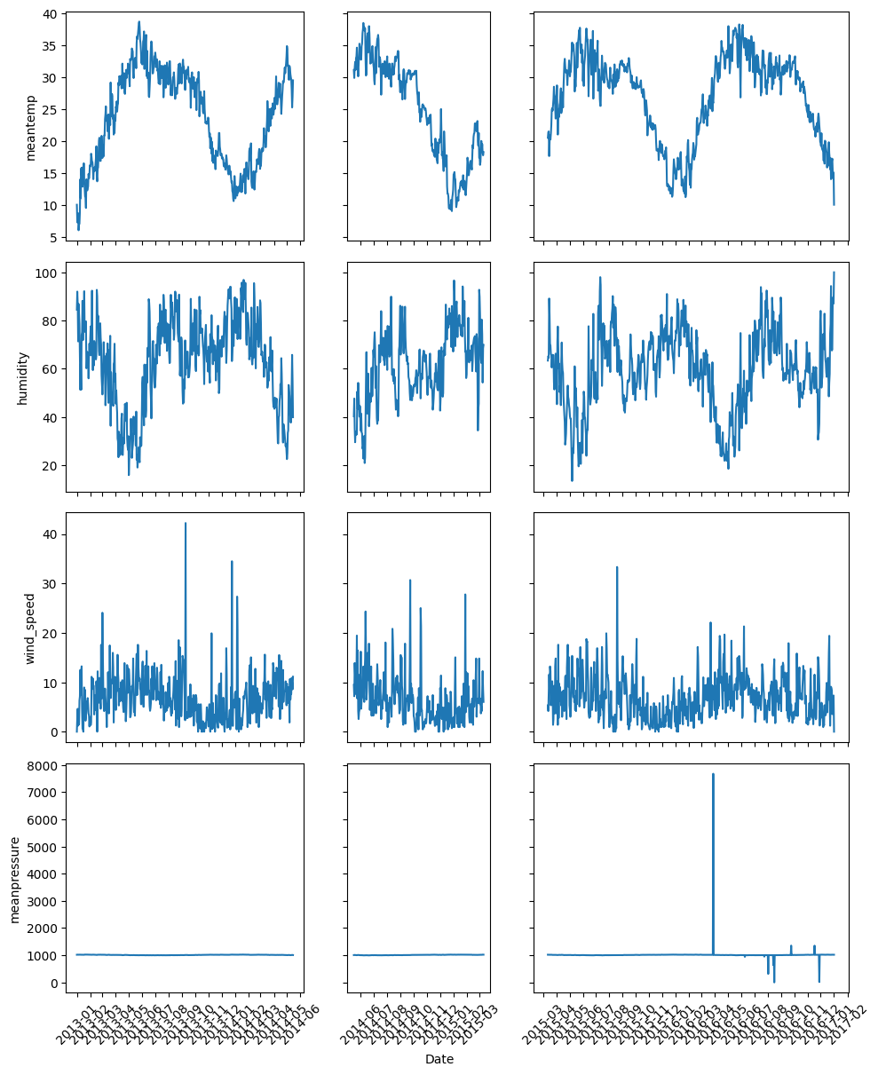
시각화할 데이터
전처리할 때, 시계열을 나눴을 경우
1
2
df_list = [df_train[:500], df_train[500:800], df_train[800:]]
cols = ['meantemp', 'humidity', 'wind_speed', 'meanpressure']
시각화
나눠진 시계열 데이터 확인
1
plot(df_list, cols, 'Date')
This post is licensed under CC BY 4.0 by the author.