Cohort Analysis
코호트 분석(Cohort Analysis)1이란?
- 데이터 세트를 분석하기 전에 관련된 그룹으로 나누는 행동 분석의 한 종류
- 코호트(cohort)는 일반적으로 특정 기간 동안 공통된 특성이나 경험을 공유함
- 고객(또는 사용자)의 생애 주기 전반에 걸쳐 패턴을 파악
- 특정 코호트에 맞춰 서비스를 조정하거나 맞춤화
Cohort: 특정 기간 내에 태어나거나 결혼한 사람들의 집단처럼 통계상의 인자(因子)를 공유(共有)하는 집단
실습
데이터: https://www.kaggle.com/competitions/neo-bank-non-sub-churn-prediction/data
데이터 로드
1
2
3
4
import pandas as pd
df = pd.read_parquet('./train_2008.parquet')
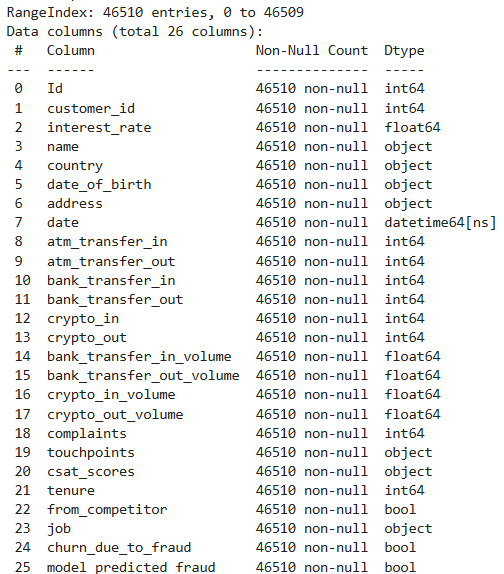
df.info()
전처리 및 코호트 데이터 생성
1
2
3
4
5
6
7
8
9
10
11
12
13
14
15
16
17
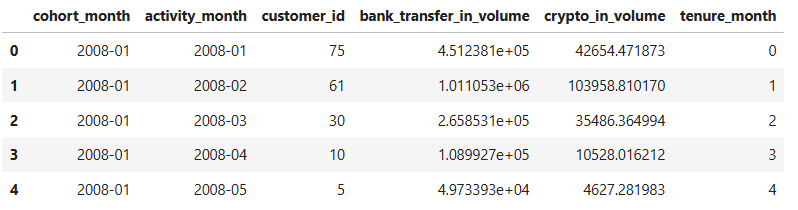
# 처음으로 활동한 시간과 활동 기간 도출
df['first_activity_date'] = df['date'] - pd.to_timedelta(df['tenure'], unit='D')
df['cohort_month'] = df['first_activity_date'].dt.to_period('M')
df['activity_month'] = df['date'].dt.to_period('M')
# 코호트 데이터 생성성
cohort_data = df.groupby(['cohort_month', 'activity_month']).agg({
'customer_id': 'nunique',
'bank_transfer_in_volume': 'sum',
'crypto_in_volume': 'sum',
}).reset_index()
cohort_data['tenure_month'] = (
(cohort_data['activity_month'] - cohort_data['cohort_month']).apply(lambda x: x.n)
)
cohort_data.head()
시각화
Retention Rate
1
2
3
4
5
6
7
8
9
10
11
12
13
14
15
16
17
18
import seaborn as sns
import matplotlib.pyplot as plt
# 활성 사용자 집계
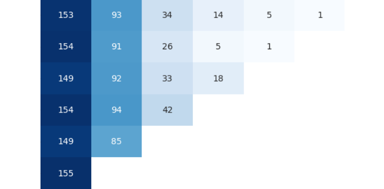
cohort_pivot = cohort_data.pivot(index='cohort_month', columns='activity_month', values='customer_id')
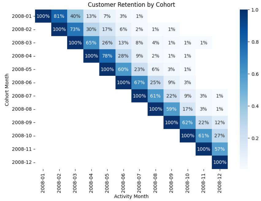
# Retention Rate(잔존율) 계산
first_month_data = cohort_data[cohort_data['cohort_month'] == cohort_data['activity_month']]
cohort_sizes = first_month_data.groupby('cohort_month')['customer_id'].sum()
retention = cohort_pivot.divide(cohort_sizes, axis=0)
# 히트맵 시각화
plt.figure(figsize=(9, 6))
sns.heatmap(retention, annot=True, fmt='.0%', cmap='Blues')
plt.title('Customer Retention by Cohort')
plt.xlabel('Activity Month')
plt.ylabel('Cohort Month')
plt.show()
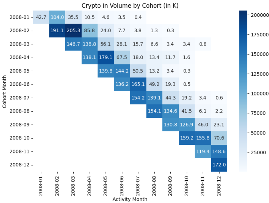
Crypto in Volumn
1
2
3
4
5
6
7
8
9
10
11
12
13
def format_thousands(val):
    return f"{val/1000:.1f}"

# 천 단위로 포멧 변환
annotations = cohort_crypto_pivot.applymap(format_thousands)

# 히트맵 시각화
plt.figure(figsize=(9, 6))
sns.heatmap(cohort_crypto_pivot, annot=annotations, cmap='Blues')
plt.title('Crypto in Volume by Cohort (in K)')
plt.xlabel('Activity Month')
plt.ylabel('Cohort Month')
plt.show()
출처
This post is licensed under CC BY 4.0 by the author.